Superior Education
NEUTRAL VS COLORED THREAD
- BOTTOM LINE
- TAUPE, SILVER, MAUVE
- BLENDING COLORS
Choosing thread colors is a complicated process. I love bold colors and my gut reaction is to choose colors that have a strong presence. My go-to colors for my favorite Hawaiian shirts are red, yellow, green, blue, purple, black, and white. I look at my closet and think that I've got all the colors in the spectrum and consider that I've got all the colors down pat. A few years ago, Heather, my wife, and I were working on color combinations for a new thread line. Heather created a variegated beige-colored combination which, upon seeing it, I commented, "That's nothing great. Who would want those colors? They're not bold enough." She occasionally reminds me of my comment because that particular color has always been one of our best selling King Tut colors, #920 Sands of Time. That's why we refer to her around the office as Mother Superior.
Neutral colors are subtle in both shade and tone, blend well, and do not compete against the surrounding fabric or other threads. They often have a chameleon-like quality which makes the thread appear as if it changes or blends with surrounding colors. Neutral colors put the focus on other colors, in the case of quilting, the focus is on the fabric. Although neutral colors are often described as blacks, whites, grays, and browns, this list is not complete. Neutral colors can exist in every color group including reds, yellows, greens, blues, and purples.

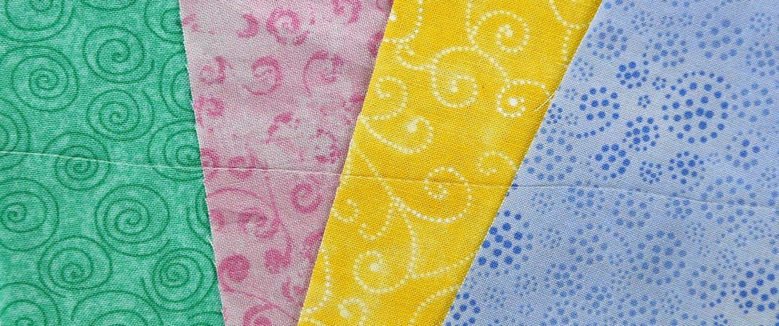
Bottom Line #623 Silver laid across colored fabric. Notice how well it blends with each background color.
The Bottom Line polyester thread is an outstanding example of a thread line that contains excellent examples of neutral colors. It is an extra fine thread and is suitable for quilting, applique, binding, bobbin thread and detail quilting. In many of these applications, a blending or neutral color is preferred so the thread can play a supporting role in the quilt instead of being the central focus. If top and bobbin tension aren't perfectly set and the bobbin thread pulls through becomes visible on the top, a neutral colored bobbin thread will blend and will not be seen. If the desired quilting effect is to have the fabric, quilt blocks, or pattern be the central focus of the greater quilt and the thread should blend into the background to allow the stitching to accent the fabric, a neutral color will do this very well.
Bottom Line was designed with neutral colors in mind. For example, the red colors appears rather dark when looking at the spool or cone of thread by itself; however, when a single strand is laid on top of medium to dark red colored fabric, the thread almost disappears. One of our favorite neutral colors, #623 Silver, looks almost semi-transparent and blends beautifully when it is stitched into almost any color of fabric. The image above shows how Silver seems to absorb the color it is placed against. Our medium green/brown color of Bottom Line, Taupe, blends well for for medium-toned fabrics. If you have a deeper or darker-colored fabric, choose a darker color of Bottom Line to have it blend. The same is true for lighter-colored fabrics. Each color of Bottom Line, whether spool or cone, will blend will within their respective color groups.
We enlisted the help of famed quilter Libby Lehman as we created twenty five additional colors of Bottom Line several years ago. We have over fifty colors that are prime examples of neutral colors. As a smooth, 60 wt./2-ply polyester thread, Bottom Line sews like a dream. Perfect for the top thread, bobbin thread, or both. The next time you want a neutral color, try a blending color that matches the same color tones as your fabric. Venture out and try a colored neutral thread.

 View Our Product Catalog